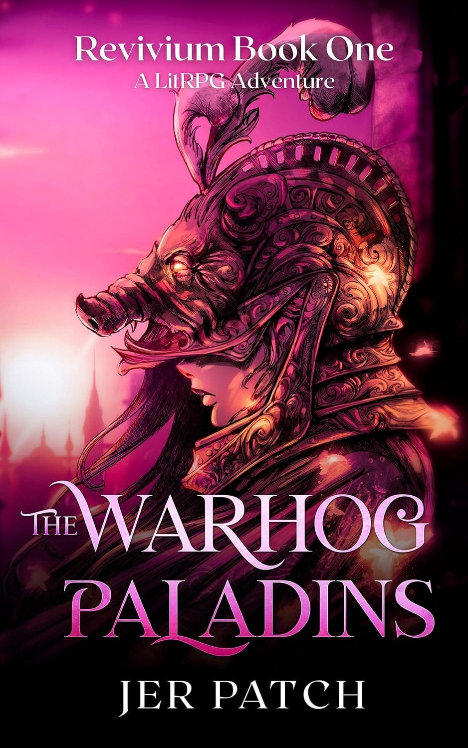
I’ve been meaning to get some work done to the stock image that created the cover for The Warhog Paladins. The original typography didn’t really fit genere expectations for LitRPG and I knew I’d need to change that to better fit in.
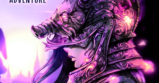
Well, I finally have the new cover:
What do you think?
With the new typography, the artist also toned down the pink and added some purples. The original is below:
It makes such a huge difference, don’t you agree?
You can check out the book and read it for free on KU: Read Now!
If you are looking for some more free reads check out this Sword & Sorcery Promo!


Love the new cover! The color change makes it pop even more.